As a follow up on our series of San Diego logo spotlights, we dive into the iconic hotel situated on the world renowned two time choice, U.S. Open golf course that we call our own. If you missed our initial post on Mike Hess logo design and brand identity here is a quick update. We have chosen three brands that stand out and cut through the clutter as worthy of our San Diego Logo Design Spotlight. The decision was based on our own perspective of San Diego tradition, culture and the stories that brought these logos and brands to life. While we create many of the recognizable San Diego logo designs we think it is important to recognize the work of others in our fine city when we see good work being done.
Now on to our second course:

Most people have an image in mind when they think of a “hotel room at a municipal golf course”. However, the “muni” course, restaurant and The Lodge at Torrey Pines have positioned themselves as one of the worlds finest destinations for tourism, food, sport, weddings and a fine nights stay. If you haven’t been to the hotel itself, the attention to detail and custom decor that surrounds every area is unmatched. The use of finely finished exotic woods, custom made contemporary modern style furniture, abalone inlays and hammered copper is unmistakably conscious of the surrounding location and follows a dynamic theme of the famous trees and seas that draw masses of people every year.

In true San Diego fashion we selected The Lodge at Torrey Pines, a brand mark that we all associate with not just a world renowned golf course but also one of our city’s finest hotels. We were under the impression that this would be a rather straightforward design process, however the story behind this recognizable two tone, stamped style logo made us realize we had made a great choice.
Our Impressions of the Logo Design:

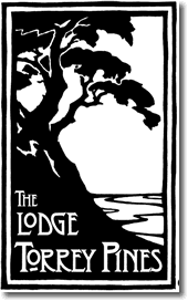
The Logo Design for The Lodge At Torrey Pines
We were initially drawn to this logo due to the culmination of the symbols utilized in it, such as the iconic pine itself, the motion intimated by the cliffside, the traditional stamping style used in the logo and the unique hand drawn type font that scrolls through negative space. It’s in line with what we see as classic San Diego and harkens to the traditional beauty that is presented at the course as well. While it is a somewhat recent design (2001), there is an ode to the iconic surrounding that aligns with the traditions and history of the course that the lodge sits on. The simplicity in the two tone stamp does a good job summing up the simple beauty of the location. It also uses artistic elements such as foreshortening of the ocean background and the rule of thirds and psychic lines that assume a motion. The result is both satisfying and exciting. However, this was only our opinion.

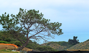
The dramatic cliff scene is no exaggeration of the real life beauty found on the grounds.
Interview With The Logo Designer:
We wanted to know more so we reached out to former creative director of Evans Hotels Francesca Smith to learn more about the creative direction and experiences that were involved in the creation of the logo.
The Lodge itself opened in 2002 and the creative direction was underway as early as 2000 and as Francesca mentions “that particular logo was definitely a difficult birth!”

The stained glass entrance teases the details of The Lodge’s logo design.
The hotels logo was the result of a collaboration between herself, Bill Evans of Evans Hotels and a woodcut artist in Washington, who she recalls was named Bruce Smith. The initial mockups called for a vertical design that was very tall and slim and was executed by the woodcut artist. While the design, Francesca recalls “was quite lovely”, it was not quite practical for the usage required. This is where she took it upon herself to begin convincing the team to try something a little different. She brought her designs to them and had them scanned and sent to the woodcut artist for him to carve a rendered stamp that was somewhat shorter. The font was then hand drawn with the original woodcut and originally was made with the name “Torrey Pines Lodge”. This required a significant amount of shifting as she had to “massage it into The Lodge at Torrey Pines”.

A painting of the original logo location hangs on the hotel wall.
As with all Evans Hotels, Bill took great pride in the detail of the decor and consistency of the design. While in the process of preparation for the grand opening the logo was used on a number of substrates. On this experience Francesca remembers “I don’t think I had a day off in the six months prior to opening; (Bill) would call me at 4:00 on a Friday and tell me he needed, say, three designs for the hammered fireplace hood in the A.R. Valentine lounge by Monday. Or a design to be etched onto the brass elevator doors. Definitely not anything found in my job description, but then again, there was no job description at the time… I think everything was moving at such a fast pace that it wasn’t until a few years later when I was sitting in the lounge with some friends, looked up at the fireplace and realized, hey… I designed that!”


The design of the The Lodge required many different applications of the logo including a hammered brass fireplace hood.
Where is Designer Francesca Smith Now:
While her talents have taken her in a number of different directions as a writer, designer and creative over the years Francesca now devotes much of her time to culminating the moving memoirs and stories passed down through her family into a work that she intends to publish and working with the City Ballet of San Diego. She sees her work on this logo in a positive light mentioning that “I am happy to see that The Lodge is still operating. It is a magnificent piece of art, and a great homage to all things Arts & Crafts.” We agree and believe that this brand logo is an accurate homage to both the location and the city of San Diego.

Is there a logo that stands out to you in San Diego that is worth us considering for our logo spotlight? Let us know at Kevin@ChrisChaseDesign.com.
For examples of our own work take a look at our logo portfolio or our web design portfolio
Also please feel free to leave a comment with your thoughts!
