
When it comes to designing a website with a synergy between engaging content, beautiful graphics and effective UX, you may find yourself wondering which comes first: content or design. Sure, the way your site looks has a significant impact on how effective you are at grabbing people’s attention when they first arrive on your site. But at the heart of things, the goal is to create a web design that delivers highly valuable content and encourages people to take action.
So, which one takes priority?
People may be attracted to the way your site looks initially, but it’s the quality of the content and the value that it delivers to the reader that will keep them on your site and even coming back again. That’s why the design of your website and the content you publish needs to work together to accomplish one goal.
Today we’re going to take a look at some quick tips for designing your site’s content so it keeps people’s interest, encourages them to explore other parts of your website, and delivers enough visual punch to get people to convert.
Writers and Designers Should Work Together
Any time you have content that needs writing and UX that needs designing, the writer and designer should work together from the start.
The truth is, writers and web designers are both masters of their own craft. Each have a unique skill set and perspective on what should be published and how it should look. When these perspectives are combined, you end up with a visually appealing and highly engaging site that people love to read.
Prior to engaging in a web design project or even a high value blog post, it’s important to follow a structured process that allows your designer and writer to huddle with the goal of answering the following questions:
What is the most important information we want to convey to the reader?
This can help prioritize the content and to create a informational flow.
What visual assets can be produced in order to supplement the information?
Data visualization, interactive elements, forms and infographics can all increase the ability for content to be effectively Additionally, the use of relevant graphics in a parallax background may be more effective for your content.
What is the goal for this page?
Layouts and messaging need to align in different ways depending on whether you are promoting gated whitepapers, driving traffic that will convert leads or producing authoritative content that will rank for specific keywords.
How do we present our call to action?
Asking a reader to take an action at a specific time is highly dependent on crafting content that presents a specific need and offers an action to help resolve that need.
Who is our target audience and what do they want?
Different audiences respond to different types of layouts, graphics, charts, etc. be sure to understand your audience, speak their language and design with them in mind.
How can we present the information in a way that is visually digestible?
Walls of text are a turn-off to readers. Find ways that allow you to present large amounts of content efficiently without overwhelming the You may find that accordions, lightbox overlays or other design elements will help to avoid the dreaded “wall of text”.
What steps does this content lead to?
If you are working on early buy cycle blog content, you may want to lead the reader to a case study or service page rather then straight to a lead Use purposeful visitor paths to get the most out of your content.
What is the article length and length of each section?
Knowing how much space you have to design around is going to impact almost every design decision on a piece of content.
Finding the answers to all of these questions, and getting everyone on board from the start, will lead the way to a beautifully designed and well-written blog.
Make Content Easy to Read
Check out these best practices for designing content that is easily scanned:
- Break text into short paragraphs
- Use headings and subheadings
- Add relevant images
- Utilize recognizable iconography
- Use bullet lists
- Format with multiple columns
A great resource of how to format easy to read content is surprisingly found on the National Institute of Health website.
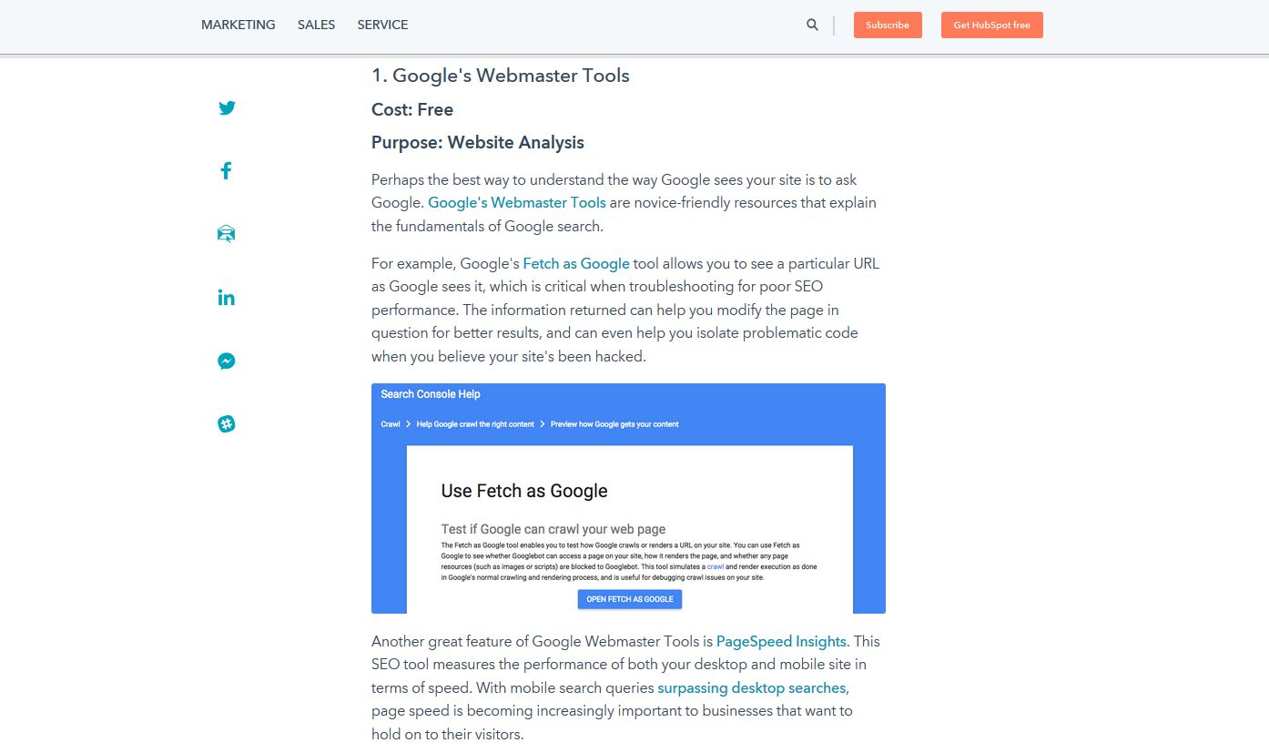
We also think that Hubspot does a good job on their site on articles such as this comparison of SEO tools.
They have all the elements needed to make consuming their content easy: a computer-friendly font style, lots of whitespace, relevant images, and small paragraphs with plenty of headings and subheadings.
Optimize Typography
It’s important your writer and designer know that the typography used in blog content makes a difference in how engaged site visitors will be.
Though this topic alone warrants an entire blog post in itself, here are some key concepts to be aware of during the content creation and blog designing process.
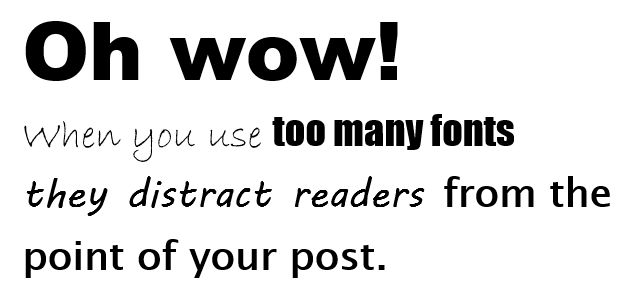
To start, limit the number of different fonts used to 3 or less to avoid overwhelming people’s senses. In fact, two font styles is usually enough.
Avoid Blinking Text
Your designer may be tempted to add flashing text or imagery to your blog posts to catch people’s attention while reading.
But the truth is, the only thing this is going to do is distract people from what they’re reading and likely cause them abandon your website.
Sure, getting people to convert is important to the success of your business. But your blog is a haven for information. This is where you entertain, inform, and educate people about topics related to your business and industry.
This is not the place for designers to add flashing animation in an attempt to get people to take action.
If your writer creates high-quality content for site visitors to read, and your designer works on tiny details such as font styles and static image placement, people will read your content all the way through and convert in the end.
Final Thoughts
In the end, content and design are intertwined no matter which way you try to look at it. And, if you want your website to be one that people enjoy coming to, you’ll need to handle content and design together.
Just remember this is a team effort. You never want your content to compete for attention from the design – or vice versa.
And you never want your blogger and designer to compete against one another either. Working together to create visually appealing, yet highly engaging content is how to stand out from the competition and establish yourself as an authority in your industry.
So, work hard to find that perfect balance, come up with a plan, and execute it. You’re readers, clients, and bottom line will be happy you did!
For more information on creating a visually stunning website with content that works for your business, contact us today.